The Expression Of A Brand’s Identity: Graphic Design And Branding
With minimalistic branding becoming the trend of the hour, can understanding the narrative behind the design process help brands find their voice?
The traditional definition of graphic design focuses more on its practical functionalities, i.e., illustrating what needs to be communicated, only considering it as a practice of doing.
Today, the domain of graphic design inhibits much more than that.
It does not merely involve typography, illustration, printing, and photography, though these allude to its origin. However, there are nuances involved that highlight why it has become crucial for businesses worldwide for branding purposes.
It involves both – thinking (idea generation) and doing (action of illustrating). In graphic design, these two elements are combined to form a channel of communication and emotional expression for brands.
A channel that helps brands instill unique messages, and appeal to their targeted audience.
In simple words, there remains a huge misconception that collates graphic design and branding with visual content.
However, marketers who leverage graphic design and branding services understand how significant graphic designers are. They know that the process and the product hold similar weight in branding. Its significance is quite visible across the marketing landscape, where graphic design is the guiding framework of the overall branding process.
It is an instrument of persuasion, instruction, and information while being an expression of a strong brand identity.
Graphic design is the instrument that instills a narrative into your brand.
Your brand cannot remain a hollow echo of products and services but instead something similar to a live strong identity. More than encompassing a corporate value, it should hold a narrative.
Just as different colors in nature add a specific pop to the world, graphic design contributes that flair to your branding projects. So, where does the connection between graphic design and branding begin?
Commercial imagery.
“They are eye-hungry. They pop”, said Andy Warhol on industrial painting, i.e., art consumed by the masses.
This form of imagery didn’t exhibit abstractness but the “literalness” in everything we use and perceive, like a Coca-Cola sticker we paste on our phone cases. Arguably, this is where the idea behind designing unique logos for brands stems from.
But that was the point. With commercialization and the rise of innovations that required a business to stand out, graphic design and branding took on a new meaning.
This new direction of graphic design and branding process was curating a channel of communication in the commercial arena that helped identify products meant to be bought and sold. And the form of illustration designed for identification was used in a unique way.
Repetition and uniformity became the two significant keys of commerce, graphic design and branding, as evident.
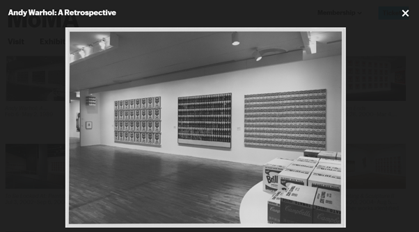
Source: Andy Warhol’s Campbell’s Soup Cans
So, this instituted a visual vocabulary of mass culture. This meant that specific visual identities represented certain commodities used broadly across the market.
This ideology of recognizable imagery is still borrowed from and ascribed to the realm where graphic design and branding intersect. For example, how the half-eaten apple of Apple is recognized by users and non-users everywhere – from MacBooks to t-shirts.
This can be connected to the brand logo, entailing replication and sensibly outlining the meaning behind the intangible idea.
Visualization of abstract concepts entails a profound creativity that corresponds to articulating an idea or communicating feelings by ascribing symbols to what is known.
Your brand’s message is an intangible concept, but you map it into reality through visual elements such as a logo, typography, color, mission statement, etc.
Logos are such channels or instruments of communication that should be provided more consideration.
It is short for logotype, combining the Greek words – logos (word or speech) and túpos (mark or imprint). The concept of a visual identity or making a logo by graphic designers is to give shape to an intangible concept and even to differentiate classes of objects from one another.
The principal reasons why this is necessary – differentiation and ownership.
Imagine there are four different businesses of jeans in the same building in front of each other.
In the modern market where competition is prevalent and persistent, there’s no escape. We know that one jeans seller has higher quality jeans than the other, while the other has lower prices.
We prefer and are loyal to one brand of jeans, so how do we differentiate it from the others?
Yes, word-of-mouth marketing can go a long way and exist before technological tools. What if we combine this with a form of visual identity?
This was also the idea behind Levi being previously known as the “Two Horse Brand” until 1928. The reason for taking on the two horses for their logo demarcated their product’s durability. This was the narrative behind the logo – it entailed a meaning that could make its brand stand out in the market and increase its share.
In simple terms – “thinking about images means being led into certain thoughts by images.”
So, they tapped into the primary step that can boost their brand recognition – the logo. And this was quite successful. For years, consumers attributed Levi Strauss & Co. as the “pants with two horses”.
How else could consumers understand the durability of their product?
Levi Strauss & Co. themselves offer an explanation. Their need to put two horses was to communicate in a language that all their consumers would grasp. There was a cultural barrier, and very few people were actually educated, but through visuals – the emotions one could grasp would remain the same.
If not, everyone could easily describe which brand of jeans they wanted they could always say “the one with two horses”. And this makes a lot of difference in elevating brand awareness. This means a brand is unique, distinct, and successful enough to be recognized through its logo rather than its name.
See, how much significance does a brand logo entail in entering a new market?
Not only did they hope to communicate what their brand is known for – durable denim – but they also understand their audience. So, those “pants with horses” did not merely become their logo but also their persona: a strong identity for their brand.
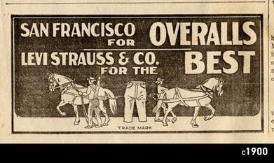
But this has undergone a transformation since.
With Levi’s growing popularity across the entire world, this logo was deemed unnecessary. To keep up with the changing market dynamics, minimalism has taken root.
While brand identity is significantly crucial to narrating the product that your business offers, graphic designing and logos keep pace with the changing rules of aestheticism. And the trendiness of how people perceive color schemes, typography, layouts, and the overall brand design.
A design does not comprise colors and lines, but it contains hidden meanings and an effective use of space.
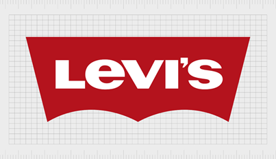
As soon as Levi started to take off, minimalism impacted its old logo. Once the brand is built, recognition comprises a singularity, as we have noticed in several huge brands.
The ‘F’ for Facebook’s app, the bird for Twitter, the half-eaten apple for Apple, and the list goes on.
Brands have incorporated minimalism in their designs and layout.
This is also relevant for the B2B landscape.
Simulation has become an escape. Any aesthetic that catches our attention occupies less space and a convenience that affords comfort to our naked eyes.
Taken as a mode to demonstrate elegance and clarity, minimalism holds a bright future.
The use of pastel colors, alignment, negative space, and bold typography is the essence of minimalism today. With immense competition across the market between businesses that sell similar products, graphic design and branding processes can change everything.
Like the Pop Art movement, we might say that minimalism opposed abstract expressionism. This form of art did not ask its viewers to instill meaning into the work or extract metaphors. But instead, assess the space and body around the art piece.
It is paramount to understand why minimalism was established to further outline why it is much preferred in the designs and advertisements that we have today.
Frank Stella, a minimalist artist, said, “What you see is what you see.” And what they popularly meant is less is more, even from a design perspective.
But in graphic design and branding, a diagram might possess something more. It doesn’t merely start with a logo or end there. Either way, it constitutes a value. The brand’s value is communicated through this.
And the very exercise of expressing oneself or recording a message began with visual art.
Surely, tech advancements have transformed our way of expression or communicating but the underlying elements remain loyal to the traditional forms of storytelling – the crux of visual art. It’s the significance of art encompassing a narrative. In graphic design and branding, logos, color palettes, typography, and use of space – the elements that construe modern design – entail a narrative.
And in branding, the entire vision and statement that the brand is built on holds meaning.
A brand doesn’t exist in a vacuum.
With the figures etched onto the walls, doors, collaterals, business merch, etc., how does this not contain any similarities to cave paintings?
Yes, the art of storytelling is not limited to stick figures, monochromatic colors, or just filling in random colors. But, at the core of marketing, creativity aligning with the business objectives is in the driver’s seat. The businesses and the audiences, in a dynamic and constantly spiraling market, demand much more.
So, the combination of graphic design and branding changes how we utilize and engage with visuals, according to how they take root in a highly commercial and mechanical world.
However, design is not merely art. It enrolls a meticulous use of colors, space, lines, font, and alignment for successful branding.
For example, the use of red and yellow in the McDonald’s logo is not random. It holds psychological significance, according to Karen Haller, a UK psychologist expert in color and design psychology, i.e., to trigger hunger:
“Looking at the positive psychological qualities of red and yellow concerning the fast-food industry, red triggers stimulation, appetite, and hunger, it attracts attention. Yellow triggers the feelings of happiness and friendliness,” Haller said. “When you combine red and yellow, it’s about speed, quickness. In, eat, and out again.”
A simple Google search tells us that red and yellow are common colors for fast food restaurants, and due to the reason stated above by Haller. Visual perception, human behavior, and emotions result in specific reactions and triggers.
Red offers that excitement because often it is associated with a ripe strawberry, sweetened candy, or tender meat. On the contrary, its association with intense emotions such as anger and rage works in favor of these brands. It calls for an urgent response, proactively influencing mood and behavior. This is why it’s used to illustrate danger.
Color holds a crucial space in graphic design and branding.
The whole element of branding is to induce consumer loyalty, boost purchasing intent, and expand market share. And in this case, its identity matters tenfold. In the examples above, from Warhol’s soup cans to Levi’s logo, color aids have been the steering wheel to propel your brand.
Colors in graphic design and branding leverage their significant influence as different forms of signals in nature and culture.
Why?
Because they help in scene segmentation, object recognition, and stimulus discrimination. The sense of specific colors leads to attraction or repulsion, depending on how they rattle our emotional stimuli.
But just as the use of red and yellow in fast food chains exhibits a sense of hunger and satisfaction, the use of colors and the reaction it harnesses depends on the context, which is not uniform.
This is why blue is often used for corporate and more conservative brands such as Facebook, LinkedIn, PayPal, Intel, Phillips, and Visa, among 43% of other Fortune 500 companies. Blue is trustworthy and calming, and all graphic designers are aware of this.
And if you ask any brand with a blue logo, why blue? The answer always constitutes two terms – innovation and reliability.
What is the narrative hidden beyond the graphic design and branding of Facebook?
On 31st August, Facebook underwent a technical glitch. This put a halt to users’ engagement with the platform because our inbuilt habit of doom scrolling brought attention to this change.
The blue ‘F’ logo turned black. Surprising? Yes. Unusual? No. Applications undergo technical issues all the time and are resolved within a few minutes or hours.

But why was this newsworthy? The brand that Facebook has built has blue at its core graphic design and branding tactics. We have a simple understanding that Facebook’s blue entails a marketing association. Due to its market share, it isn’t required to stand out and have an eye-catching and impressionable logo.
We all know what Facebook’s logo looks like.
When the glitch changed the color of this F into black, consumers assumed that maybe this was a rebranding effort by the organization. This is how intertwined the color blue is with Facebook across the market.
But you know what the most fascinating aspect of this is? The actual narrative behind the color and the logo – Mark Zuckerberg’s red and green color blindness, alluding to which he said:
“Blue is the richest color for me; I can see all of blue.”
This is a story behind the use of the color blue. It’s out there but hidden behind the marketing understanding of why brands use the color.
Visual accessibility was a huge reason if not one of the only significant ones. The brand’s association with blue color is emotive behind the curtains of the marketing landscape, along with its bold sans serif typography.
In graphic design and branding, every executed design is intentional.
Graphic designers do need to align with client requirements, but the first thing on their minds should potentially be the experience.
Is minimalistic art the future of B2B graphic design and branding?
Where do the pros of minimalism end and the dangers of losing the details begin?
Even though there is a need for a new direction in art and design, where do we lose sight of our vision – art as expression? Isn’t expressing oneself hidden in the details, or is less the new more?
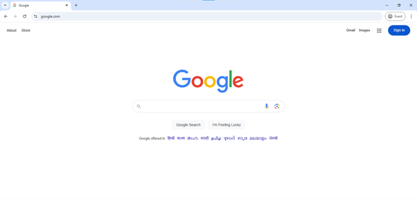
In the tech landscape, a lot has changed. Twitter became X, and we have built-in AI assistants like ChatGPT. But some things have remained the same. And one of them is the homepage design for the Google search engine.
Google’s search engine homepage grabbed my attention not because of its exceptional use of colors but its simplicity. We can say it embodies absolute neutrality, stripped away of distraction and popping colors. Not much regarding the graphic design and branding of Google’s search engine homepage has transformed.
We have come a long way. While brands have caught up, most users still gravitate towards minimalism, and AI-generated images are widely criticized. And Google retaining its UX design, even in today’s atmosphere, is commendable, to say the least.
The graphic designers know what they are doing with the appropriate spacing and proper alignment of the CTAs spread across the page. It’s minimalistic, making it increasingly user-centric.
It’s minimal with carefully chosen attention-grabbing vibrant colors, such as blue used for their CTAs that provide a clean and formal look, against the white background.
It grabs the reader or scroller’s attention quite instantly.
Every logo, color palette, typeface, or use of whitespace amidst other intricacies of graphic design and branding is an existing proof. Especially in the immensely complex and expansive space of digital marketing.
Visibility, readability, and direct communication.
Expression is an integral component of these platforms, especially Instagram, Facebook, and Twitter. The platform itself allows space for creativity and innovation in the form of content curation. With a plethora of creative content within the apps, quite evidently, the external graphic design and branding of these platforms are quite minimalistic.
But with minimalistic brand design becoming a trend, are we, as creatives, losing our touch or making the brands lose their personality? Or is minimalism making us rethink whether we need a balance between functionality and creativity to finally stand out in the market?
But one thing is for sure. While minimalism may be the trend right now, it does not project the direction that graphic and branding design might take, especially in the B2B landscape.
Uniqueness and creativity have to remain.
To strip away a brand of any one of these is to take away the trust ideal customers have instilled in it. Art and design have always been the common ground of experimentation, and their future is as fluid as ever.
https://ciente.io/wp-content/uploads/2024/11/The-Expression-of-a-Brands-Identity-Graphic-design-and-branding-website-1.jpg
2024-11-25 10:05:05


